Evaluating a user interface…
How many errors do people make as they are trying to use my interface? How long does it take people to do particular tasks? How does my design compares to a competitor’s design in terms of task completion time, or error rates?
These questions and many more beg for answers whenever I am tasked with the job of designing, re-designing or evaluating an already existing interface.There are a lot of techniques available for evaluating your interaction designs, either with users, or even without users. But before conducting any sort of design evaluation, we need to have a design focus. We should be focused on trying to understand how people use, or will use what we’re creating. What are their problems? How can we come up with design improvements to address those problems?. After coming up with a design focus, we should also think of setting goals. How many users should we test with, and at what experience level? How do we know when we are done?
As I said earlier, various techniques exist for evaluating a user interface, but I would break them into 2 broad categories:
Evaluating Without Users
This is cheaper than trying to recruit users, it involves a systematic step by step look-through for an interface, searching for problems.
Does the interface satisfy a checklist of well-known principles of good design? — Heurestic Evaluation
Will a typical user be able to complete each step of a task, without difficulty? — Cognitive Walkthrough
Evaluating With Users
The methods here are many, and I can’t go over each individually in this post, but to mention a few, we have qualitative usability studies, controlled lab studies, Field studies, Field Experiments, A/B Testing e.t.c
Having grasped the idea of what it takes to evaluate an interface, let’s get started with the SupermartNg Cart UI.
The SupermartNG Cart UX:
What to Evaluate: SupermartNG Cart UX
User Level: Expert (4.5/5), tech background and a consistent user of the platform for about 2 years
Task: Remove items from Cart
Design Reality: The present design has about 45 seconds — 2 minutes task completion time and 30% error rate (to get an item removed asap is very challenging). All these depend on user level, browser, luck e.t.c
Goal: Task should take about a second or two (task completion time), and 1% error rate (i.e I should only make a mistake once on 100 trials of this task).
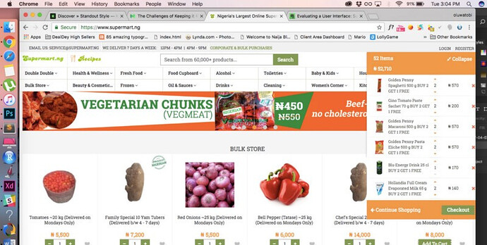
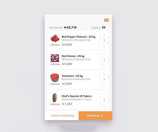
Now, let’s get started. The present SupermartNG Cart looks like this:
But it doesn’t look like there is any issue at this point, until you want to go through your cart and probably remove some items.
So where does the issue lie?
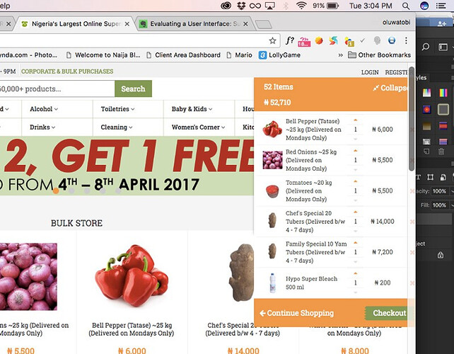
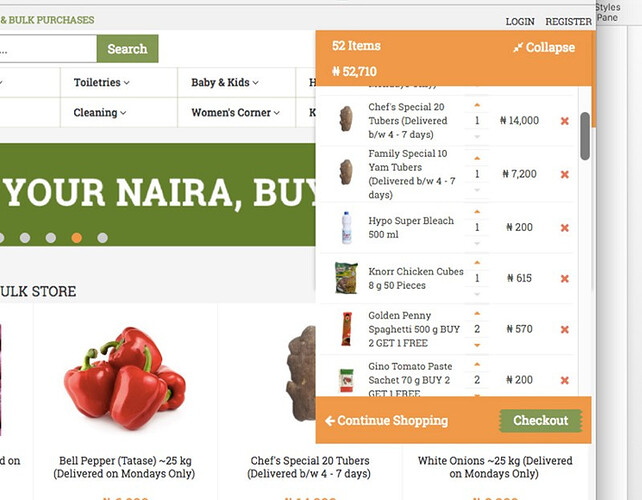
Depending on how long the names of your individual items are, once you have more than 7 items in your cart, removing some then becomes a puzzle.
What do I mean?
On my latest version of Chrome (Version 57.0.2987.133), the Google Chrome scroll bar disappears and re-appears, and each of your attempt to remove an item becomes a guesswork. As you can see from the image above, the Google Scrollbar shows up and goes. Despite Apple’s ability to hide the scroll bar for Chrome when not in use, this UI still needs to thrive at the mercy of the overflow scrollbar for that particular cart div. The worse happens when both the scrollbar for the div and the scrollbar for Chrome both shows up, you know the rest.
What can be done?
Removing items from the cart is a task that any e-Commerce website should be certain that their customers will regularly do, so one should not make such task a cognitive load. For this particular task, how do we redesign the UI to offer a better experience to the users?
The issue could be resolved with a First Aid Approach:
We increase the padding of the content from 4px to about 10px, or reduce the width of the table to about 95%. Any of these actually gives us this:
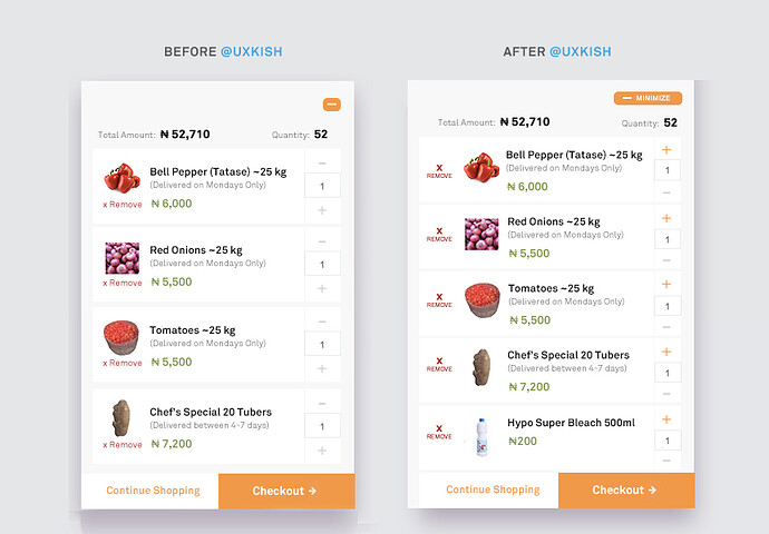
Or we could offer a subtle redesign:
<imgstrong text src=“/uploads/default/original/2X/4/4a4bb4a2ea6ea84a37a592e7fa9db78a6134f090.jpg” width=“690” height=“479”>
Or a complete redesign:
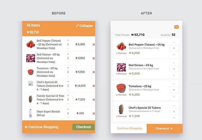
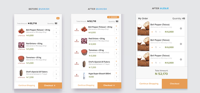
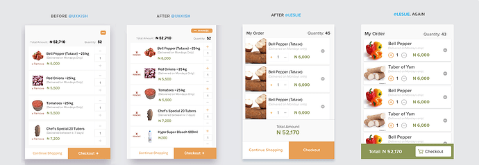
The Redesign
The total amount of your products sits at the top left and with a very high contrast text against its background colour. There exists enough space for our scrollbars which becomes activated as soon as a user hovers on that cart.
Using (+) and (-) makes it glaring how to increase and reduce item quantity. We have introduced an hierarchy in the display of each item details so users eyes can scan these details more easily and immediately differentiate an item’s name from it’s delivery timeline.
The “remove-from-cart” label has been repositioned more strategically, making use of an icon + text, you can now remove items at the speed of thought.
It has been argued globally if there is a need for including a button for the second choice Call To Action, but while this choice is largely subjective, we have included a Continue Shopping button on the left, but with a larger emphasis on the Checkout button.
The principle of recognition over recall renders the initial minimize button (collapse) needless, it has thus been replaced with an icon that people are used to already, in their browsers and apps.
I fell in love with the redesign the most. Though, most times users embrace a change in UI with a negative reception. It wouldn’t be surprising if the First Aid approach or subtle redesign performs as equally great as the overall redesign. But as with all design endeavours, conducting a user observation study would help SupermartNG make more informed decisions on which approach works best in fixing this daunting UX issue.
I hope to continue the UX Design Series, as it will not only help me in sharing what I have learnt so far in UX, but will help me connect with more UX-oriented individuals in doing greater stuffs. Your feedbacks are highly welcome.
Twitter: @OluwatobiMayowa
Medium: OluwatobiMayowa
