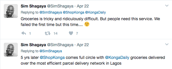
Sequel to the tweet from the former C.E.O of Konga.com, Sim Shagaya. I woke up to a link to Konga’s new project daily.konga.com. I was particularly interested to find out how their model works.
For a service of such, I would expect that I can shop for 95% of my groceries on the platform, and also a reasonable delivery fee. The delivery timing as indicated on their website is within 24 hours, which is quite okay for me. I would also love to know the thoughts that went into their choice of name though? Konga Daily?? Perhaps the USP is centered around same-day-delivery, well time will tell.
The Design Decisions
On the present Konga.com homepage, there are two tabs at the top left [Konga.com] and [Konga Daily], while this does not particularly work for me, it might serve for a majority of other users. Clicking on the [Konga Daily] tab redirects to the URL daily.konga.com, and the design here doesn’t quite cut it for me for a launched product. Here are the observations I made while using the Konga Daily website.
The Dialog Boxes
The first issue I encountered was with the confirmation dialog boxes. I added a Geisha Mackerel & Tomatoes Sauce— 155g to my cart, and a dialog box pops up, asking me if I want to go back to store or Check out.
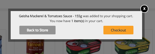
On adding, a CWAY Nutri Milk Drink Pear- 520ml, I also encountered the same confirmation dialog box. This appears to me as an interruptive use of the “Confirmation System”.
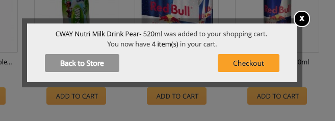
Let’s take it to a real life scenario, imagine being asked by the attendants at SHOPRITE “Are you sure you want to buy this” each time you pick an item from their shelf, I mean each item.
Confirmations, dialog boxes, pop-ups, overlays or whatever aren’t always needed because they can actually increase mistakes. One should be selective of the instances to present a user with these boxes, since bombarding a user with confirmations for every action, eventually makes them disregard it. It is not enough that the dialog box in itself could have been better designed (visual hierarchy, button placement e.t.c), having to repeatedly display this on my screen for actions that do not warrant it, couldn’t be more interruptive. Nick Babich of babich.biz does a good job of stating out 5 essential UX rules for dialog design.
The Shopping Page Real Estate
I proceeded to check out one of the categories http://daily.konga.com/fresh-food and the page there has some UX issues too . This to me, is not a justifiable use of the page’s real estate. Why do I need my cart fixed on the right side, without an option to close it, when at that point “I am still shopping”.
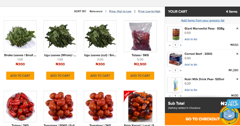
I mean this is a shopping stage, it might make sense to think this will reduce the user journey, by having to shop and decide on both screens, but that decision being made on your behalf, without an option for you to “un-want it”, does not only violate one of the factors of Heurestic Analysis — User control and freedom, it also doesn’t appear to me that users will recognize this design system rather than recall it. This cart also suffers from the similar design problem I recently wrote about for SupermartNG on removal of items from cart, which generated a lot of design discussions on Radar by TechCabal. A lot is wrong with the interactivity on that cart, some funny interactions and change of states while trying to add items to the list, remove items e.t.c. I also personally feel the live help icon is covering some essential information, like total amount and delivery amount.
The Mobile View
I finally decided to access the Konga Daily website on my mobile phone, and guess what I found, Mobile First? Mobile Last? Nope, it was Mobile NO.
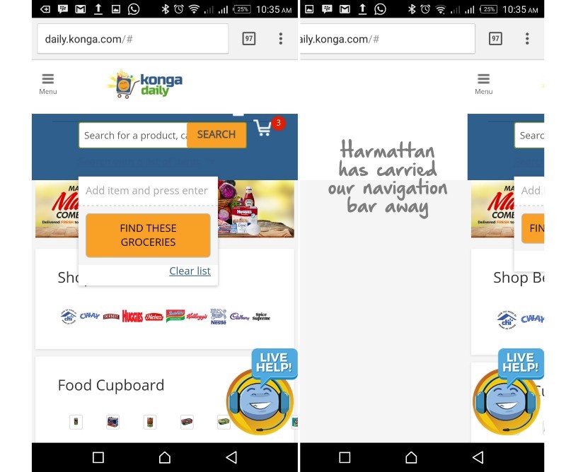
On clicking the hamburger icon + menu text, the navigation bar that was supposed to slide in from the left, while laid out vertically, was nowhere to be found. I actually didn’t have time to inspect element on that page, but trust me Harmattan has carried our navigation away. I mean the whole of it.
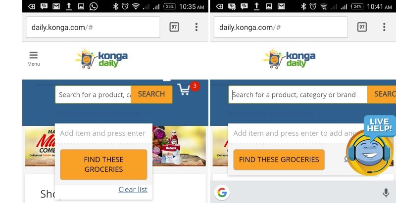
On clicking the search bar, it expands into the rare ends of the phone screen, pushing the Search button almost outside the screen.
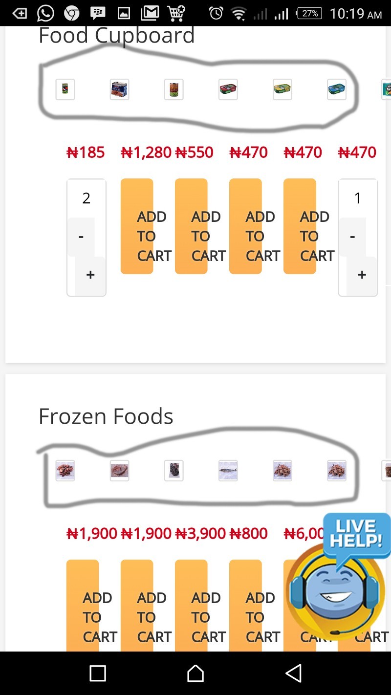
The product images are extremely tiny, I could hardly view them or recognize what they represented. This could be easily fixed, either by setting image’s height to about 150px, or just by adding a min-height attribute to the product image’s class.
We can then work on the media queries for optimal display of these product images on smaller screens like Android Watch, iWatch e.t.c
Where is the product name? I can only see the prices of products and very big Call To Actions, requesting me to add to cart products whose images I can barely see. The CTA’s in themselves need a whole lot of work. The padding is off, line height is off, the button in itself doesn’t have the standard layout of a CTA on a mobile device. The concept of Fitts law has being violated here, rendering these important buttons unusable for seriously these buttons need more work, the spacing, the layout.
Small touch targets require more accuracy to hit and hence make users work harder. In this case, users need to reorient their finger, from finger pad to fingertip, in order to hit the target while expectant of a clear visual feedback. One concept worthy of mention is from the Android Interaction Design Guidelines, which recommends at least 48dp high and wide to ensure a physical size of about 9mm regardless of screen size. The recommended target size for touchscreen objects is 7–10mm.
Content Strategy
It would also be very good if the “Popular Category” div can be removed altogether. Not only are they serving out of context on that page, they actually aren’t necessary until there exists actual “Popular Categories” based on data.
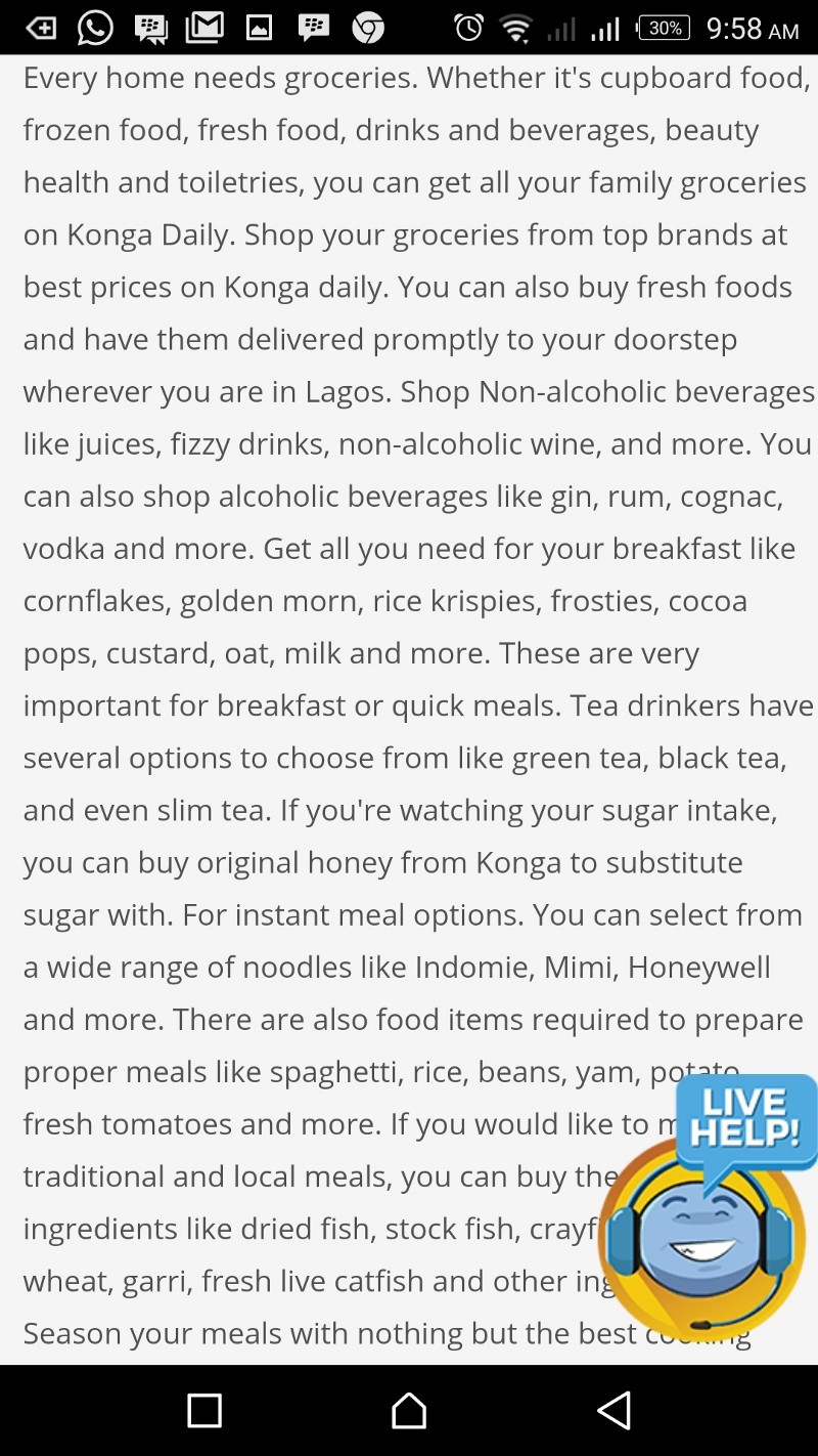
The content under the hangline “Buy Groceries Online” is way too much, it makes me feel like I’m on a blog.
This should be reduced to capture the main USP’s in about 5–6 sentences.
Users are here to shop, and boring them with long texts of how cocoa pops and rice krispies are very important for breakfast, seems off from their intentions. If there is a need to actually have this content on that page, it could be segmented, leveraging on drop-downs.
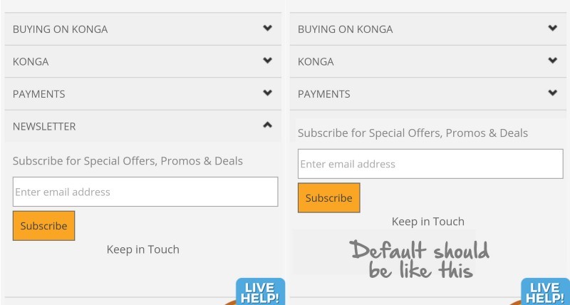
The newsletter subscription box should not be hidden. Leaving it open reduces the number of steps of subscribing from 2 to 1.
Final Thoughts
One good thing about design is the opportunity it offers for iteration. User research is one aspect of UX design that brands need to invest heavily on, and consequently design with empathy for them, it is not enough that a product is useful, it has to remain usable. User-centered design in itself solves a lot of problems outside design, when done right. I already discussed in an earlier post the role of good UX design in effective customer service.
Twitter: @OluwatobiMayowa
Medium: Oluwatobi Mayowa