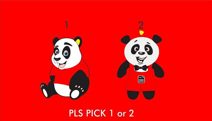
2, draws my attention more, looks like its paying more attention to me than 1.
@lawwyy will you like 2 on your cap or throw pillow
what do you guys think. @Lord_Commander @Lord_Starkphils
errr… on the door of my restaurant , if or when I open one. 2 looks more like he is ready to serve
1 is very playful, thinking creche and all and good for all dem cuddly souvenirs, pillows, bedsheets etc.
what if you were running a branding company, and you wanted a fun, cool and playful logo. which one will be your pick
i will pick 1, 2 looks like something you would use for a “food related service”
@ValentineO what its a delivery company, do you think 2 will still work for you?
yes… would still do for a delivery company.
1st one obviously, you want your brand to be playful as a brand firm.
- the lack of symmetry in the eyes and eyebrows of 1 is too disturbing and distracting.
I will pick 2
try 1 with 2’s head
I like the head of 2. The body needs to be replaced.
2 looks happier 
In my eyes,
1 is like: I’m here to have fun and play with you
2 is like: I’m here to help and you will have fun while I help.
…y’know something like that
So, I’d pick 2
@Tunji, I’ll pick number 2 body & clothes but for the head, number 1. Number 1’s head looks more proportional for the body. As for number 2, the body looks like he/she has been working out and is in shape with nice swag. It reminds when CNN was talking about the Dapper Car Wash Guy as well as the guy who was making suya while wearing a suit. The number 1 looks he/she is lazy and just sits on the couch all day. So number 1 head, with number 2 body.
2…'cos it looks more active.
