good day guys,
after being inspired, encouraged as well as challenged by @elepsis from these UI with Figma Design delivered daily thread, i decided to use this medium to keep you updated on various design concepts, ideas that i come with.
My primary tool is adobe illustrator, i would be updating this thread atleast once in two days through the week with designs ranging from logos, illustrations, ui designs and anything i create using illustrator.
would love your sincere feedback. its all about getting better. thanks 

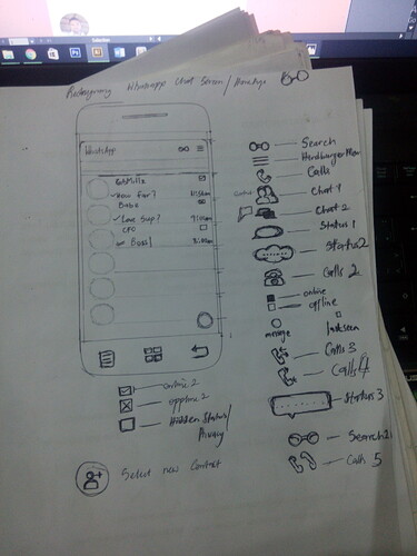
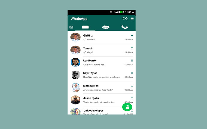
this is something i just completed recently, i thought of redesigning whatsapp UI with less words and more icon. what do you guys think?
All the best with this @GbMillz
Make sure you push yourself.
Always ensure that what you’ll work on tomorrow is better than what you’ve done today. Give someone a reason to come back to check what you’re working on…inspire someone.
Together, we’ll all get better.
You may want to look at your file again. The elements of the UI are looking squashed.
Clean sketch by the way.
Thanks boss! Please could you be more specific about the squashed elemets? kinda seeing things differently from here . thanks
Looks vertically squashed from here.
Same here but the notepad is looking good.
I see it now, thanks for the feedback
@lordbanks and @eaweb would make corrections and upload for more feedback asap…thanks once again
here is a logo concept/ idea i did today, i tried to portray a mask itself in the logo. i made two different logos around the same concept. waiting for your feedback. thanks
first one
second one
hows the weekend going guys? i decided to give you guys something for the weekend, its a logo concept, its a visualization of what comes to my mind when i think about General Electric Company. if i had to enter into a logo design competition or was told to rebrand the company this what i would create.
Wonderful job done man.
I think the vector icons used for the ui redesign of whatsApp appears stretched.
and for the logo of GE please look at other options, its not looking nice to me.
overall, well done!
@khussen thanks so much for the feedback and encouragement, as regards the whatsapp icons i wanted to make them of equal sizes ie occupy same width and height to maintain a balanced/perfect look, but it seems doing that makes it look that way considering that the icons are of different shapes/form, would improve on it. secondly are you talking about the first version or the corrected version of the whatsapp design?
thirdly the GE logo, is it the concepts or choice of colors or just everything? lool. would love your opinions on it. thanks once again.
Letter M , various design concepts and implementations. pardon me, if the images aren’t looking sharp enough, its a screenshot taken right inside adobe illustrator work space. thanks
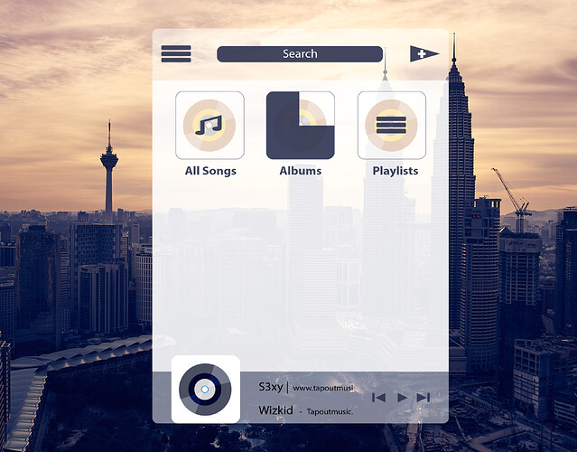
hi guys, i felt i should give you guys something for dessert before dinner. its a music player i designed today. please lemme know what you guys feel about everything.thanks
If you bought an expensive music player/phone that came with this design how would you feel?
Loool… I know right, but it ain’t about getting it all perfect but trying, I believe if I keep at it, I will get better, remember that’s the essence of creating the thread in the first place. Anyway thanks for the feedback. You guys will just try not to get bored with my designs. Cos I am here to learn. Thanks
Icons Friday
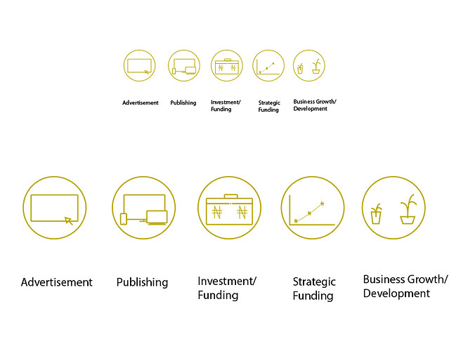
font awesome icons doesn’t provide icons for all words or terminilogies you might need for your app/website, so i came up with these icons to represent the words typed below each of them.
these icons are a collection of what will be my 100 icons challenge, which will be a little or more Nigerian themed. How does each term fit properly to each of these icons?
I designed the icons to perfectly fit into font awesomes icon size ( fa-stack fa-2x and fa-stack fa-4x) respectively. Barka de Jumat to all the muslim brothers and sisters in the house. Have a nice weekend y’all. thanks for the feedbacks in advance:grinning:


