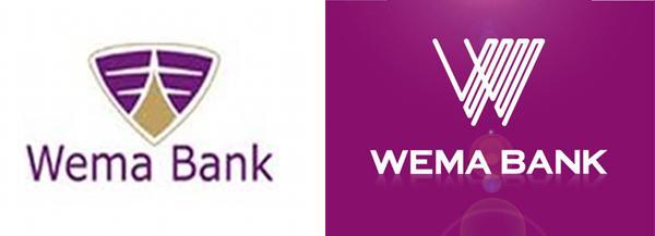
I suppose this is an attempt to make the brand look more modern. What do you think? Yay or nay?
Does it translate well for a mobile first world?

I suppose this is an attempt to make the brand look more modern. What do you think? Yay or nay?
Does it translate well for a mobile first world?

As @onyeka points out, there’s a lens flare.
This is a weird logo already…but the lensflare…must have been put there to please some Dilbert-esque PM. SMH.
this new logo cant be used across all platforms… the old logo rocks… \m/
Lens flare AND reflection. Classic.
They went from a luxury car logo to something that reminds me strongly of an existing foreign bank logo/an 80s electronic device. Not worse or better IMO.
@seyitaylor beat me to it - I was about to share this here on radar. I think it is a bit difficult to connect the new logo to banking… Basically, if it isn’t broken don’t fix it (at least unless you have something better).
It was kuku broken. Now it’s broken-er. Rebranding is such an opportunity and this one was squandered.
The logo is so complex it breaks down when you make it smaller… It has no strength, no presence… The typeface… Ugh!
Oh crap. This was bound to happen.
Wait, where is @leslie now? Isn’t this your habitat?
And what is it with the color purple and banks? FCMB recently purpled up too.
Someone somewhere wanted new project to happen. Signage, Stationery, marketing materials etc. Ije wuru has landed.
Or the skewed look on my browser, which prompted to to resize the window to my heart’s content to make things even look worse. Just great.
Also, it’s always funny when some Nigerian brands try to explain their new logo. I’ll just leave this here.
In summary, our new look represents:
The never ending line
A continuous thread
Staff, Customers & all other Stakeholders linked as one
Colleagues working together as one
All working as one for continuous growth
From a design standpoint (and I’m no designer) I prefer the old one. The new one looks it was designed by a large committee of people with a person ineffectual at Visual Design.
This has nothing to do with UX, OR UI, but visual design. And the latter seems to be lacking where the former seemed to possess some level of visual appeal. Even though I feel the former may have been enhanced, even with a lens flare.
And then there’s this.
All’s well in stolen art, I suppose.
I will not analyse this logo
I will not analyse this logo
I will not analyse this logo
I will not analyse this logo
I will not analyse this logo
I will not analyse this logo
I will not analyse this logo
We know the drill… Someone just wanted to dash Money!
LOL… Oga… pls share you 2 kobo thoughts.
Been busy. Didn’t see this thread on time.
Long and short, it sucks. Looks like purple vomit. Not sure of there’s a real disease with those.
Totally bad. It seems they do not know the acronym KISS - Keep it Simple and Short.
Lolz! The horror! Well at least they curved the edges. That ought to count for something. 
Looks horrible. Previous one is waaaaaayyyyyyyyyyyyy better.