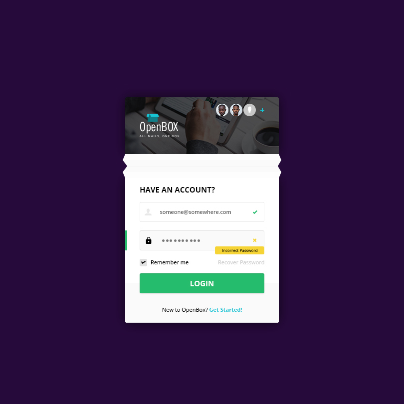
Okay I’m doing this for the first time. Just worked on a User Authentication page and decided to share. Tool - Photoshop; Fonts - Open sans and NewsGoth.
5 Likes
Looks good and all but,
a.) What are the user photos at the top for?
b.) Why the “fold”? On Mobile this might not have the desired effect you want…
c.) The “onFocus” for the input field “may” get lost
Pros
1.) Love the verification and error notification
7 Likes
Thanks @leslie. The user photos section uses the concept of multiple mail accounts since the login is for a mail aggregator app. The fold is just to add a little twist to the look and the focus is actually on the password. Thanks for the observations… Will work around them to improve it.
I get the need for twists sha…sometimes you want to create something that’s delightful. But in doing so, we should be careful not to create something that’s unnecessary.
Also, the multiple accounts, you’ve got to find another way to showcase that. As it is, it looks like an “Users online” sort of thing. You can create a pop-over that allows users to switch account. It’s an extra step - yes - but the less confusing one.
Well done bro. May the pixel remain strong with you
4 Likes
Thanks for that… #EffectiveImmediately. Checked out your dribble page; awesome works there. Won’t mind paying a visit to your workspace sometime.
1 Like
And an extra feedback on the heuristic. A cool error notification, but nothing to help the user in determining the exact error… except to keep re-typing.
Have you considered incorporating a show/hide icon?
![]()
1 Like
Thanks @ayomidotun… That must have been an oversight. Will fix that too.