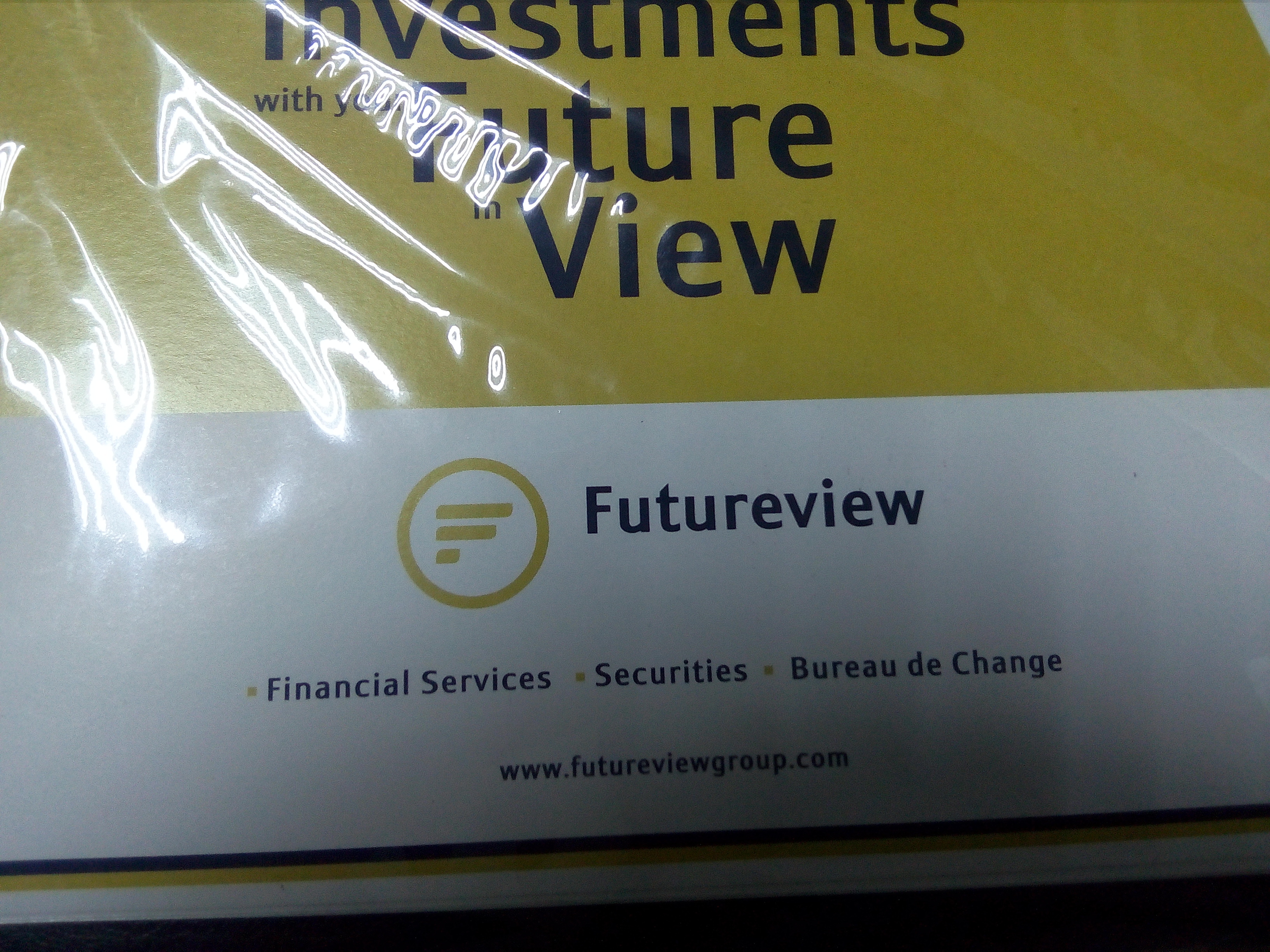
Stumbled across a company named Futureview www.futureviewgroup.com that has similar logo with Paystack and they’re also in the financial space
@xolubi and @shollsman, could this pose a brand risk in the nearest future?
Stumbled across a company named Futureview www.futureviewgroup.com that has similar logo with Paystack and they’re also in the financial space
@xolubi and @shollsman, could this pose a brand risk in the nearest future?
Would be a good idea to upload both logos so we can see what you’re talking about. The futureview website is broken (welp).
That looks reasonably different from this:
https://paystack.com/public/images/opg.png
Nothing to see here, IMO.
If you look closely, you’ll notice that the number of bars in the Futureview logo is less than those in Paystack’s by one. The Futureview stack is also set in ring lacking in the Paystack logo. Also the colors are different. Most people will not confuse one for the other.
The bars in FutureView represent the letter “F” while Paystack, is pile over the other…it’s called stack! i.e Dasuki took stacks of Dollars!
And the webmaster of futureview website will think that their ad campaigns are working because of spike in traffic; not knowing that their identity is under investigation by Cabals…
Lmao, if there’s a webmaster, that is.
What makes you think this is not an ad campaign.
It is not the same.
Its not the same but its similar, so I guess that makes all the difference in the world!
In addition to this… the bars in FutureView represents the letter F while Paystack’s represents the letter P
Lmao. Three minutes of my life, gone, just like that.