A new blossoming Nigerian social forum has been launched which aims to be information, entertaining and also profitable to its users. It’s a Post & Earn forum which looks to compensate or gives incentives to its users who participate in discussions by either posting new topics/questions or commenting on them.
Please help us review it on http://www.kamalsbase.com. Your comments/suggestions are appreciated. thanks
(+) The experience - on mobile atleast - has this feeling of an already bustling community. Had something to do with the crowded UI. Well infested with clickbaits.
(+) The views counter is a nice touch. I believe you nailed your category curation too. The Uni categories;
(-) Why do you require phone number during registration? There isn’t enough proposition to warrant that. I tried to register but sorry can’t give you my digits, too early. Hence I couldn’t try out your post and earn offering.
(-)Kamalsbase? I know the name means something to you, but trying to wrap my tongue around that, left me with a lisp. Use the description/byword under the logo to introduce the name. May perhaps make it easier to digest.
Kamalsbase[LOGO] - Join our digital base for great discussions and awesome content.
(The base after Kamals starts making sense at every first and subsequent glance)
With proper positioning. I see this vying for serious eyeballs…
Thanks @87_chuks for the review, We greatly appreciate. Positives taken, Negatives would be worked upon. But, for the Phone number registration thingy, there’s not a single thing attached to it except the fact
i. You’ll agree there has to be some form of user registration verification in order to keep of spammers. And this forms includes email and/or phone number.
ii. For single user verification (atleast to some extent)
iii. The proportion of targeted users using phones far outweights those having emails and some having emails, don’t even use them often!
iv. For convenience. It seems easier verifying a registered account through clicking a registration link sent to my phone than opening my PC/mail services, scanning through my mail in order to find it and clicking too.
v. Big web apps use it too without user worries for exactly the same purpose as listed above.
That’s about all concerning the Phone number requirement
@87_chuks, concerning the naming, hmmm, it’s got some meaning attached to it, which when known you’ll agree is alright + there are hardly any good/easier names to get when buying a domain names, it seems all taken. We believe with time, users would get used to the brand, so many are getting used to it already, probably it’s your first time. (Sorry about the lisp LOL) and lastly, please do register and help test all it’s other features. Thanks
I’m sorry sir. I see what you’re pointing out. Non-existence of a 404 page. Bcos, that page/thread doesn’t exists. We’re working/fixing that out. Thanks
Dunno, you may call it a better/promising nairaland
Would love to know the UI fixes required[quote=“Farad, post:10, topic:7996”]
I dont know if its one particular post, but the text is not justified. Its not pretty.
[/quote]
text alignment are first & foremost at the user’s discretion, otherwise could be edited to look better.
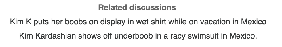
But to be sincere with you @mrkamal , somethings there needs fixing. One of these is seen via the image below. Like it is just so confusing. How do i navigate through in peace?
Thanks guys for the review. Some of the suggestions made have been implemented. We would appreciate more reviews & suggestions especially possible ways to gain more traction.


 Just noticed that some while ago sir. (If not for your reviews/help) It has been fixed now. Thanks.