Sometimes, as designers, we look at some websites and there’s this satisfactory joy in the depths of your soul, knowing that a lot of thinking, planning and attention to detail was invested in the making of the site. Other times, and this happens when you’re looking at many other websites (including the variety that are created/hosted locally), it feels like a gut punch, left-hook to right-uppercut, a swift kick between the legs and price of tomatoes splitting your back…all at the same time.
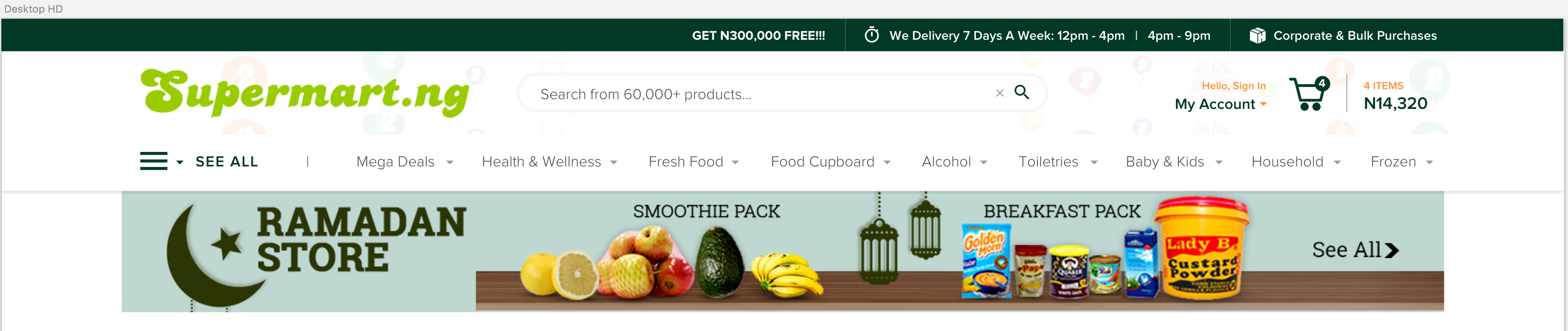
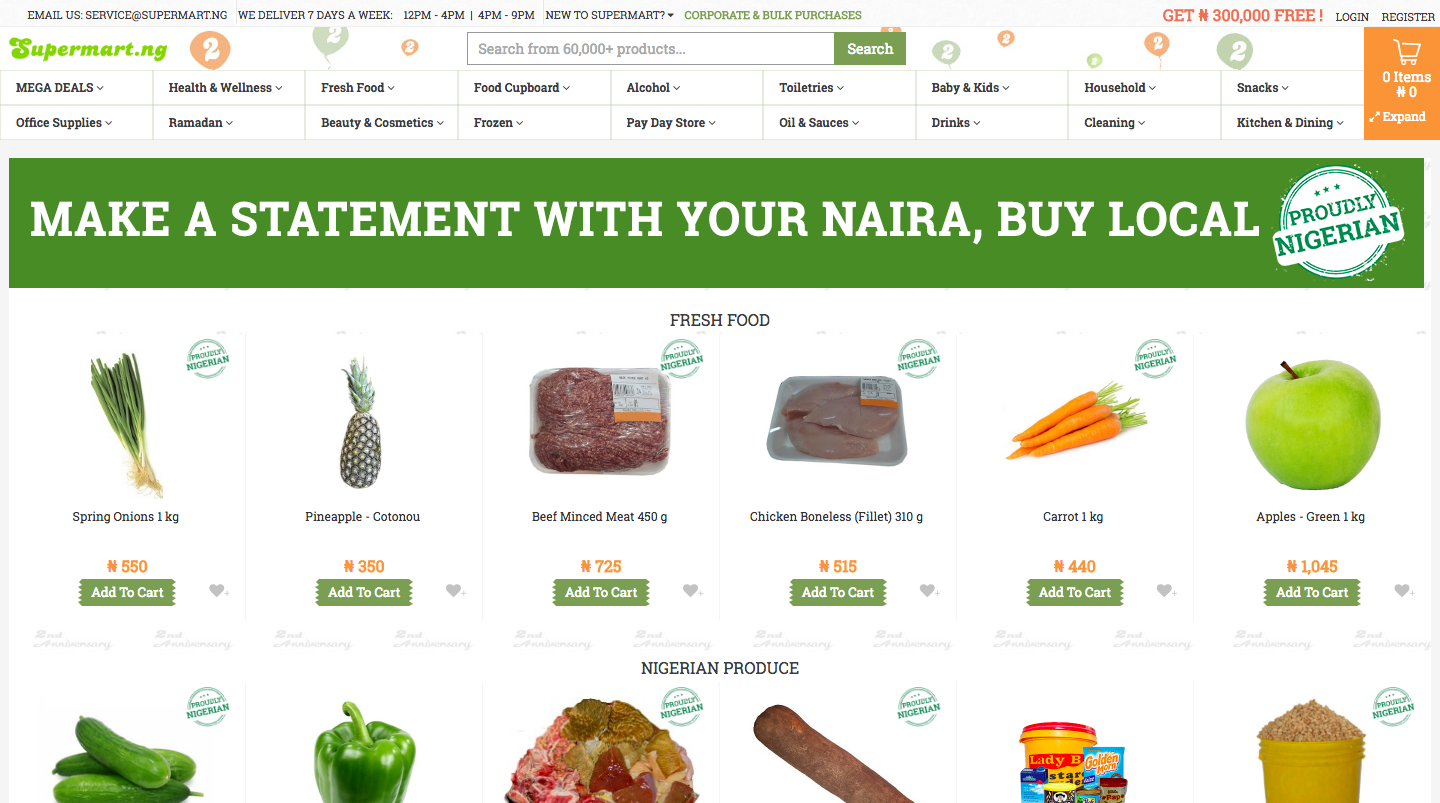
Today, we’re taking a look Supermart.ng as our case study. We will try to
- Understand Business needs / objectives
- Understand user needs and how to we can affect their behaviour to drive sales.
- Use all that we’ve figured out to create a better e-commerce landing page for the brand.
This is more of an exercise that focuses on information architecture and content layout.
Let’s begin ![]()
#Disclaimer:
This isn’t a sponsored post by the aforementioned company Nor is a sly ploy to get creative ideas for free. This isn’t “Spec” work, in any form. This is purely for design academics and development.