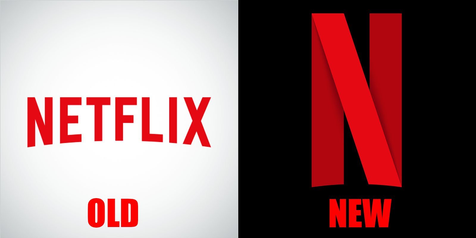
Netflix just changed its logo, designers what’s your take on the new N?
1 Like
Ewww…
But then, we rant and rave and eventually settle down and live with the new logos. 
2 Likes
Cool…like i mean it. This is really cool.
N ‘weaved’ with Film tape - am thinking the old magnetic tapes. May see a number of variations of that N with optical tapes et al.
They want to own the letter N, same way Facebook owns F, and Google, G.
Pas mal!
Actually Netflix says it’s not their new logo. They claim it’s a new “brand element” (Whatever that means)
1 Like
It’s not bad. They are following modern standards. Keep it simple.
…can’t really say I am a design person, but I have an intuitive feel for what seems cool or not.
I like the new Netflix logo.
I was one of those who were up in arms when medium changed their logo last year, but ultimately, it still delivered the same experience, so I couldn’t really complain.
If the app does what it should, users will ultimately accept whatever icon or logo you put on it.
I love it.
Correct me if I’m wrong, but the logo follows principles of Material Design, you can clearly see it looks like a cut piece of paper or cloth folded to form an “N” with the shadows and everything. 
Usually, Brand elements are additional aesethics that are part of the brand’s visual language.
Ugh. Too complex.
This should help: http://www.slideshare.net/ProfessorMathur/the-7-brand-elements-and-their-selection-criteria
3 Likes
They never said the logo follows any “Principles of Material Design”. There’re no “Principles of Material Design” that influences Logo design in anyway.
Exactly why I said “correct me if I’m wrong”
Should have kept the old one, N for ?
I hope you know Netflix is one word?
i know, i preferred the old logo as it was with the name written in full to just the N
It’s not a change. They’re most likely going to use it as their App icons, social avatars and all that. It’s a brand element, not the real thing (yet). I figure when they gauge that people are more comfy with the N, they’ll slow begin to phase out the old logo but for now, The Old logo isn’t going away anytime soon.
Well, we shall see.