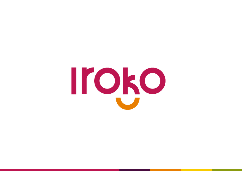
This is my first post here, first of all there are some really talented folks here. this is my something i did while i had some spare time a while back, this is my own take on the IrokoTV logo , started on the web UI, but work overshadowed it hope i find time to finish it.
I wonder why there is no design category here it would be nice to get peoples thoughts on things Nigerian designers are working on , or to inspire other people.
If people like @leslie would post more, there’d be a proper case for this. We aren’t eager to create orphan or desert categories just because. Funny thing is people are looking for designers as frantically as they look for devs, perhaps more so, because they are an even rarer specie. Or maybe they they aren’t rare, they just like the shadows?
EDIT: The idea is that categories should emerge organically and in response to forum intent. Orphan categories are harmful because they reinforce the idea that the group it represents is inactive. We don’t want that to happen. If we can get people like @ire@namzo@udezekene@Clive@onyeka@Tonianni and more that I don’t remember right now to lead the charge online like some of them have done offline, this could be a thing.
You made a valid point, i guess its post more design related things. Yeah designers are usually in the shadows, and its due to the weird fact that we mostly live in our heads, it’s the really brave ones that tend to show up in human form and showcase what they are working on.
I will contribute my fair share and hope others will follow suite.
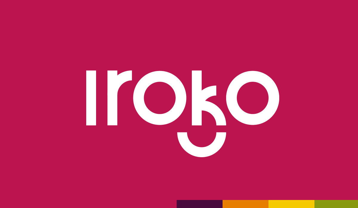
@onyeka its simple, the current iroko logo went too literal with the meaning, thats the iroko tree with the pc tab and mobile icon which i find weird
Lets take Netflix for example, its made up of 2 words Net (online, web, internet) and Flix = Flicks (movie, series, video content), you don’t see the literal translation to iconography of internet and a movie reel or filmstrip
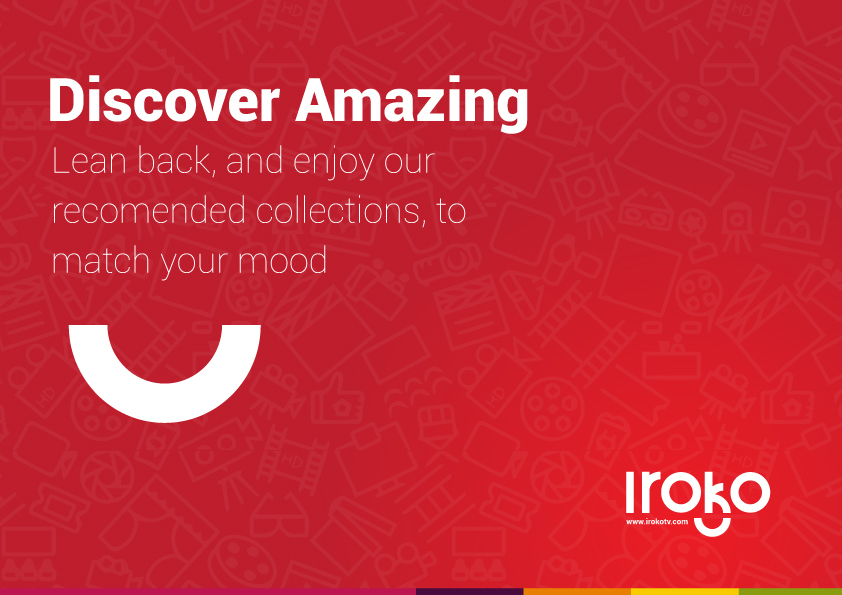
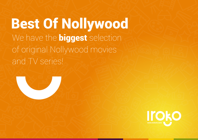
Mine just happens to come from the fact that iroko provides visual pleasure hence the smile with two O’s serving as eyes, its all built out of a long rectangle and a half circle
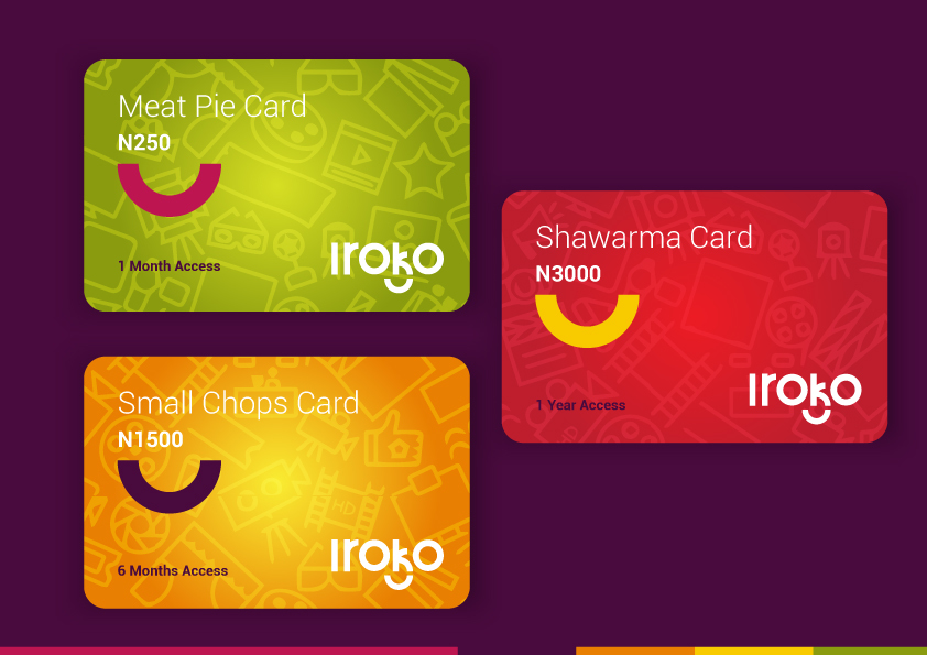
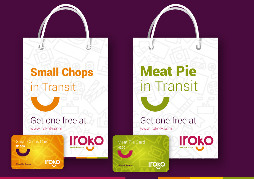
the meatpie, shawarma and small chops part was the fact that if their service and pricing offerings were to be equated to the cost of something weird that makes people happy and jason once talked about ho their pricing was based off the cost of one meat pie all i did was extend that thinking to make it fun at least
its all my own opinion and my weird idea might be wrong
please Pardon my lack of writing skills, and punctuation
Never thought about the points you pulled there. Great idea; great execution… I think we can have more design articles on radar to help get better at what we do.
While I appreciate the idea behind the visual representation with the two O’s and the hollow semi-circle as well as the simplicity, I’d make some modifications. The placement of the semi-circle as well as the similar thickness feels like that’s a K becoming a B. The semicircle in it’s current state is forgettable. For reference, look at what iHop and Amazon did with the use of smiles in their logos. Overall, clean presentation.