Thoughts?
I knew it!
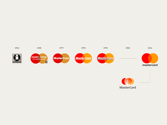
Two days ago, I was reading an article on some popular brand logos and their evolution. When I came across MasterCard’s, I thought, “someday soon, these guys will probably modify their logo, in line with the current design trends (minimalism, flat design, and mobile design)”.
Funny enough, the two areas I highlighted that would be the first to go were those "teeth"and the font.
Hehe😎

