Yeah, the ‘progress bar’ covering the album art? Many reviewers have been against that, @taslim even suggested that “the water can rise and fall with respect to the music pitch” which makes sense too. Actually why next stage of putting an idea together is testing and getting feedback.
Well, for the wave up and down dragging? i will say we won’t conclude till we do a test. haahaha no worry i no go shock you 
Thanks jare @spokentwice
Nice.
We also would like to see the tools you used to design.
Thanks @Freshboi_Ekundayo.
Entire Design with Sketch App and interactions to this day in Flinto
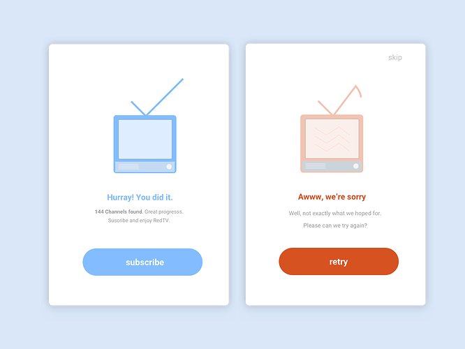
Day 11 of 100: A Flash Message(Error/Success) Design
Established wisdom holds that good error messages are polite, precise, and constructive. The Web brings a few new guidelines: Make error messages clearly visible, reduce the work required to fix the problem, and educate users along the way. --Nielson Norman Group on error messages
you have real nice designs, i love the thing with the 404/Error page… i love great designs and i always advocate for them, because truth is people’s first impression about your product is actually based on what they see. Keep it up, i hope to hire you some day, when i am able to pay you 
lol… thanks for the feedback. I also think that advocating for great design should be our next step in Nigeria and Africa in general. We have lots of good developers but the state of UX(truly solving problems with design) is very bad.
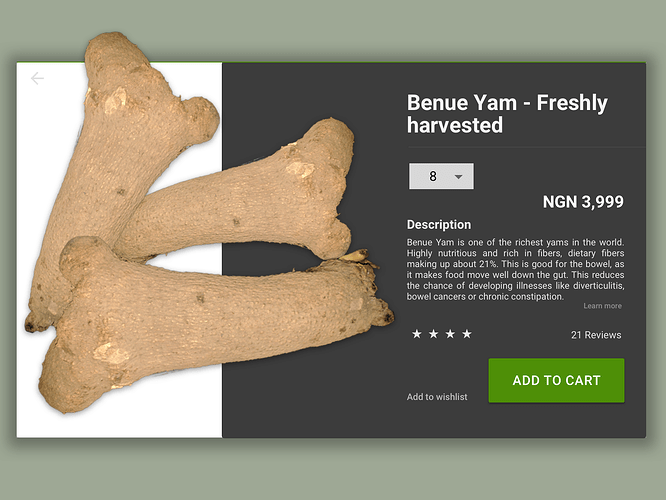
Day 12 of 100: Crafting a minimal e-commerce product page
From my little experience shopping online and with some brief research, I have put together what I believe are 6 key things to be mindful of when designing a product page.
- Product title
- Product images
- Price
- Most important call to action
- Item rating and reviews
I encourage you to check out the full design gist for context
Final design
Nice one. Is there any reason why the quantity is in a drop-down? Say I want to buy 4 dozens (48), won’t it be easier for me to enter that in a text field?
Great question… well you are very right. Didn’t think about your case initially. Text field, drop down and steppers are all great options and drop down might be the worst.
I will go for steppers( steppers and text field ) which combines + and - steppers and a text field in middle.
Thanks for the great feedback Ben. Nice catch.
What do you think?
Your yam is getting out of place, I might just steal one o
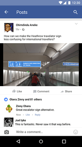
Day 13 of 100: Direct Messaging: Facebook post-screen redesign
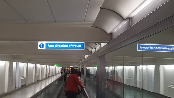
While I was thinking about the idea for this challenge ( took me almost a day ), I was tagged on one of my big Ogas’ Facebook post by a designer friend, Blaine Billingsley who challenged me to have a take on a London Airport’s travelator sign which is somewhat confusing for debutant international travelers.
You can read article here: Direct Messaging: Facebook post-screen redesign
Current travelator sign
New travelator sign
My Facebook post screen design
This is really great work. Love the deliberate attention to details you’ve applied across all the redesigns. Superb stuff. Well done!
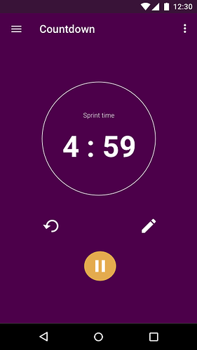
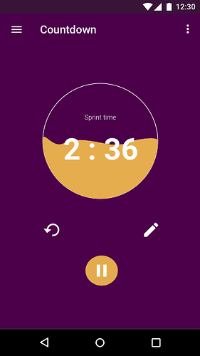
Day 14 of 100: Day 14 of 100: How I designed a Countdown Timer using the “Design Hierarchy of needs”
…Today’s challenge was to design a countdown timer and as I was thinking about it, I stumbled upon a concept — Design Hierarchy of Needs, by Steven Bradley that I doodled on one of my books. I decided to design the countdown timer based on the concept… read complete article
Where have you been all these while?
Hahahaha, yeah lots of things
Personal commitment (went for a design talk and other ish) , work commitment ( day job ) and lot’s of pressure to always deliver daily – well, I have no excuse.
Managing them slowly but I know it will only get better. No pressure No rush…We will get to 100
Thanks for asking jare.
Any feedback?
Top notch 10/10, as usual. 
Day 15 of 100: ON/OFF UI for switching between clock types
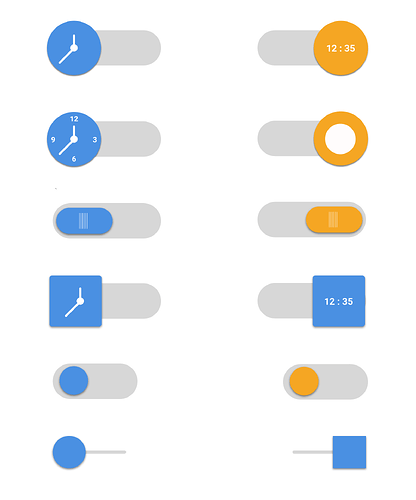
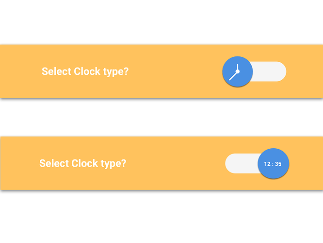
Today’s challenge was to design an “on/of” button and I decided to apply it to a time app’s settings screen where one is always asked to set clock type — whether for analog or for a digital display.
The biggest question I asked myself was how can one switch between an analog and a digital clock view from a clock settings screen? Read full article
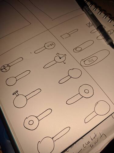
Sketching after I asked myself the main question
Converted some of the sketches
And then finally chose
Good one.
I’m not certain, but I think, as per (Android?) design guidelines, the label should be something like “Clock Type” or “Clock Mode”, not a question or instruction. Or (perhaps) even better, no label at all. In that case, the size, graphics and position of the switch would be such that a user would easily know what it meant.
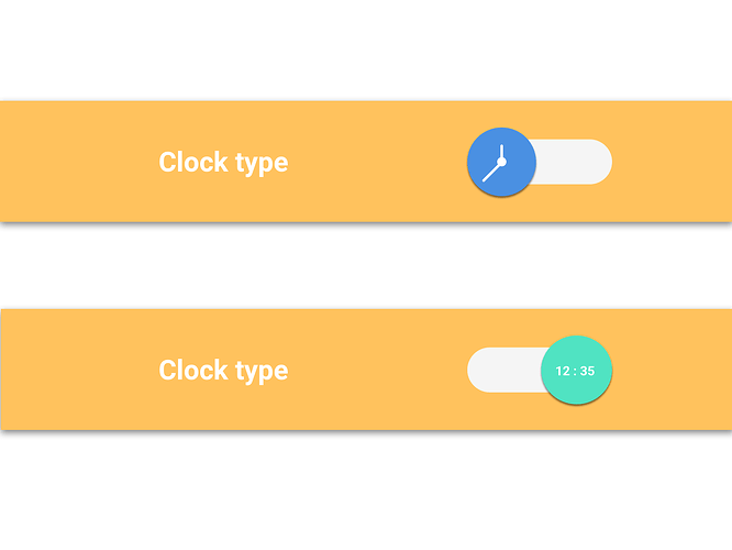
And I think it would make for a better contrast if the clock changed color when switched (like in some of your initial designs). It helps the user see instantly that something has changed. Try observing some switches in Android (Alarms in Clock app, Bluetooth and WiFi in Settings, etc)…
Nitpicking, I know… feel free to ignore me.
Yeah very interesting points and that’s why feedback is always awesome. I love them ![]()
Well, I did not really consider a specific platform…tried to be generic…but you really made an interesting point around label guideline. It should just be a direct and simple statement and should not try to reinforce what a user already knows like using generic words like I did “Select” or try to seek an answer ( coming as a question). “Clock type” or “Clock mode” makes super sense to me too. ![]()
You are right in terms of graphic size and position:- I thought about that and let’s assume it’s a mobile icon, if I resize the icon to meet a particular platform’s guideline, will the visual cues still be seen and understood? So it still raises a lot of concerns in being a good solution but well…testing and reiterating always is key.
And for switch color change - Good one there.
NB: I intentionally avoided gray or another dull color for one of the switches. Why? I can’t say which is weightier in the two options–whether the analog or the digital one. Which one should be the main color(bright) and which should be off secondary color ( dull ).
Thanks for the detailed feedback @Diakon
Made a little modification and still not really for any particular platform.
