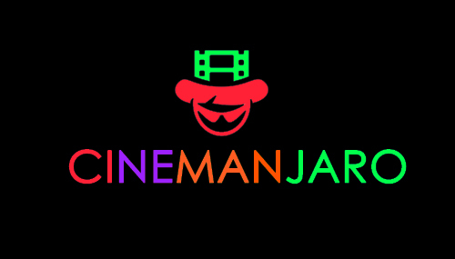
Cinemanjaro is a startup community cinema project. It is basically a low end cinema for people who cannot afford or does not have access to high end cinema’s like genesis deluxe or silverbird. Our graphics designer came up with this logo. We need your opinion. Tell us if you like it or give us reasons if you think its not nice.
Considering your name is an obvious play on the Mount Kilimanjaro, wouldn’t a silhouette of a mountain work better than the face we don’t know what it represents? That is, besides the fact that the letters m, a, and n in the name are of the same color?
Also, the letters grouped by colors… perhaps shed some light on those. There’s always a story behind logos to help with identification and association. What’s yours? We’ll be flying blind without it.
Let me help you out. You really need a graphics designer. I would refer you to this guy. Though He is really expensive but He is very worth it. http://depictiondesigninc.com/. His name is Gold and His number is 08036853705. Tell him from Bidemi.
Traditionally, logos should be recognisable in both black and white as well as in colour. Although I think there is a shift happening concerning this because of the digital era etc. But that’s debatable.
However, it’s always good to use that as a benchmark. Will this still be as effective in black and white? Will my logo still convey the same brand identity/message in black and white?
So my two cents is basically not to focus on the colours just yet but the style/placement/icon etc. I hope that helps
P.s. I think ‘Cinemajaro’ rolls off better than ‘Cinemanjaro’
 . Just stick to two softer colours. Vector is not bad though.