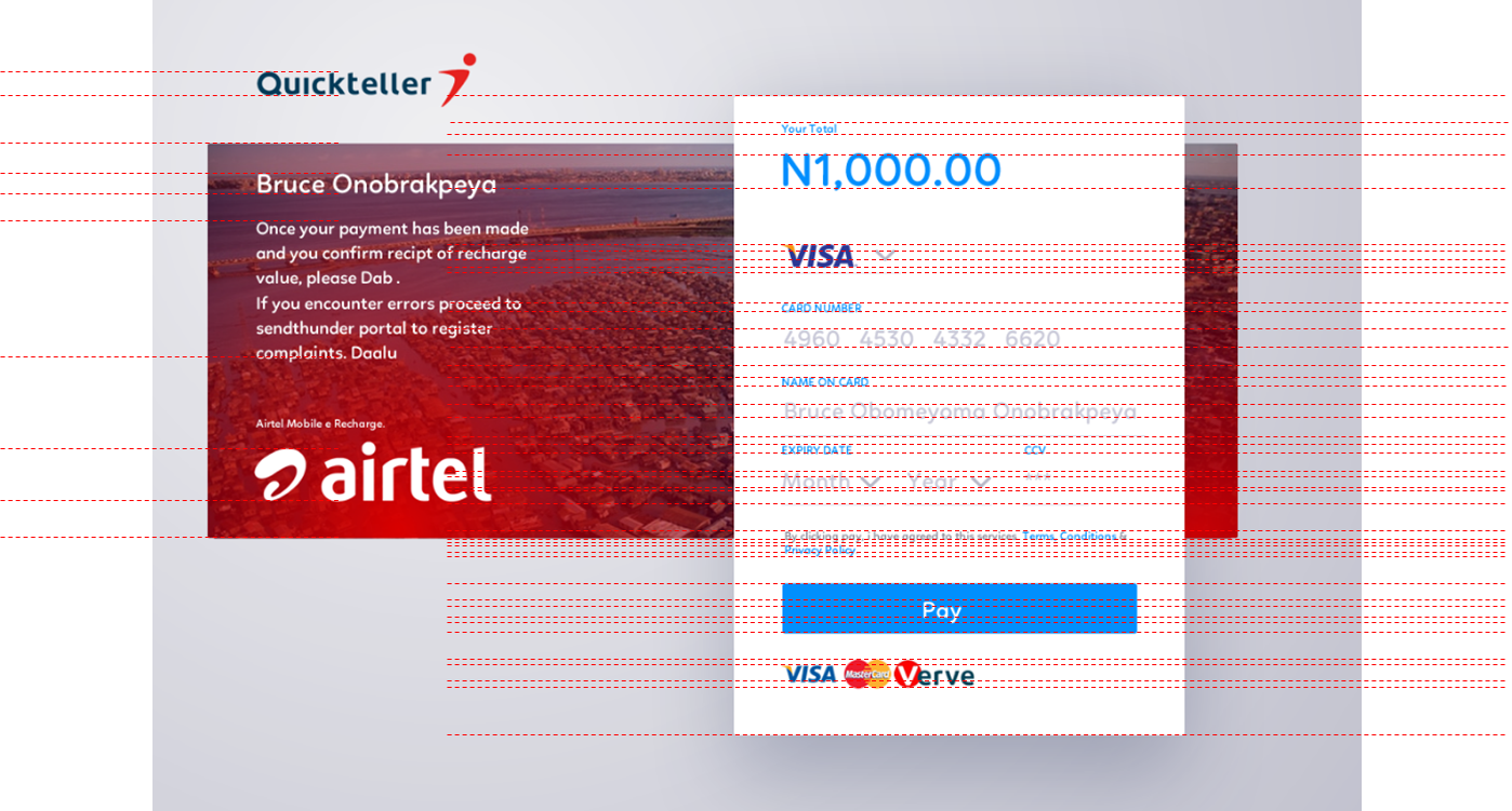
OH not at all brother, in my poor defense, i think the error is on my part for not showing what the grids look like, the basic thinking with design is that it has to be modular, from the layout, typography to the grid and the general outlook of things, which means it brings a certain sense of order to the whole system, and means you can scale things depending on what the situation of the system in question requires.
the thing with graphic designers is that, we tend to see things not as they are but how we can make it better. of which we are usually wrong. But our main job besides painting pretty pictures is to educate
By introducing “lines” (i believe you meant guide lines) horizontally you completely loose sight of the basic things that makes the design work, as the ancient prayer goes “as above so below” if you have the horizontal so must the vertical be included. for one cannot exist without the other in your humble consideration.
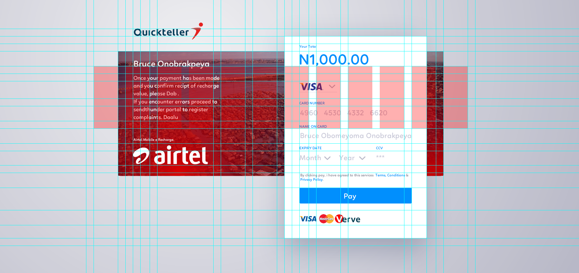
The canvas: is 1920x1080 pixels it uses a centered 12 column 1200px grid with a 24px gutters if you have the main section for the content at 1200px that means we can have a small scale of 4:3 meaning at 1200/4= 300px or 1200/3= 400px applying our 24px gutter horrizontally to ensure we have perfect squares that means we can scale 24, 48, 72… to ensure our layout does not fall apart that is 800px for content 400px for sidebars or modules or you can scale by our ratio of 3 and achieve 900px and 300px this adequately takes care of our “shape and form” situation it means regardless of the size of the element be it type or shape or jpg it has to sit in between 24px or scale to 48 or 72 or higher
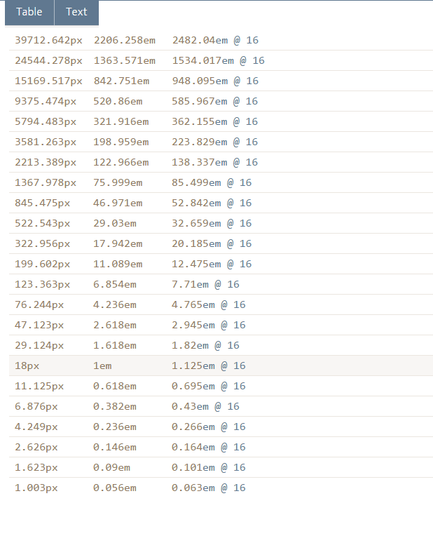
The typeograpahy: based on our weird modular scale, i set the base type at 18px( due to the type: linotte works best at 18 in terms of readability and no squinting to read the text) and applying a golden mean of 1.61803399 (the base at which most things in nature occurs or were deigned you can google golden mean/golden ration to find out more or if you ever read anything about grids/layout in design you wiill understand, and i am sure the chair you are sitting on to read this was designed based on that ratio) we can then scale up by multiplying our base 18 x1.618 and subsequent results to get h1 to h6 and then p (paragraph text), which means that our scale is 11(this was scaled down),18, 30, 48, 76, 124, and 200 rounded off to even numbers you can see the chart below or you can create one at www.modularscale.com this brings me to the question why the actual height of the type was considered and not the size in px?
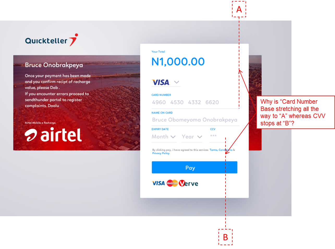
the ccv part enables you to enter 3 numbers it would be unfair to extend that line to ikorodu, and on most checkout modules the months are abbreviated. and we might as well stretch the logos on the bottom to your proposed location.
With regards to “sectional coordination” i swear i have no idea what that means.
the idea with most things on the web or mobile is the ease of use trumps the payment logos but the fact that they fit in our 24px gutter horizontally sort of makes it work.
i wonder what these unnecessary elements are? the payment button looks too odd i guess
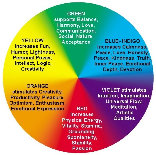
with the color you might be right i tend to go with what i feel emotionally, but the great color deity said primary which is red, yellow and blue i choose red and blue and i sort of like Airtel, but wait, if it pairs our blue and red down to psychology this weird wheel might work.
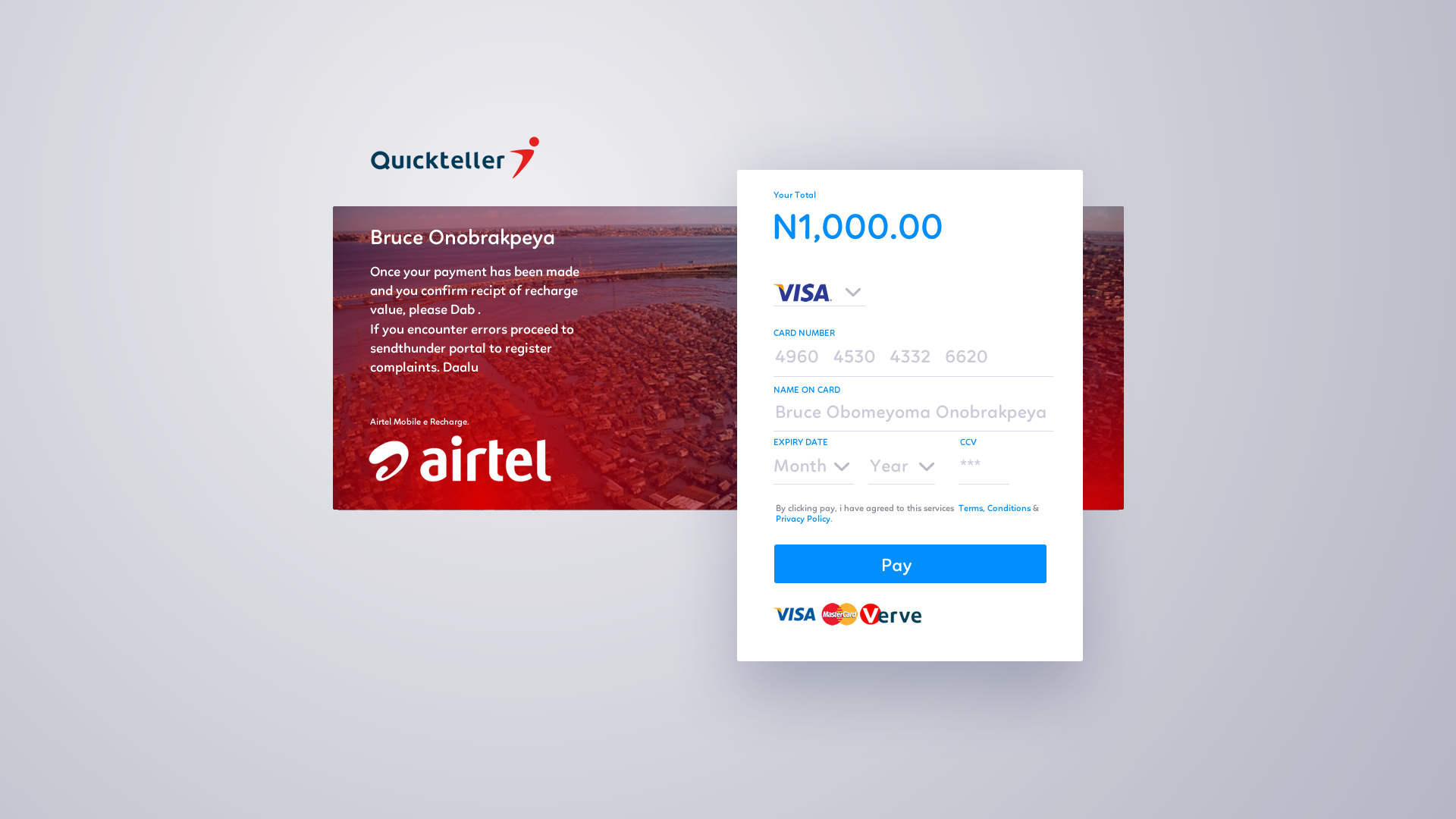
that picture is Makoko and the weird thing that looks like bridge is 3rd mainland. in Lagos personally i like the place
Here’s the design with the grid the only error is that the banner behind the payment module does not scale with the grid
thanks for the feedback i do appreciate. sorry for the long grammar and the clear lack of writing and punctuation.